QuantByte blog
Insights on financial independence, building resilient side income, quantitative strategies, and disciplined routines.
 Feb 16, 2026
 Investment Returns and the Risk–Return Trade-Off
Why expected returns rise with risk, and how stocks, corporate bonds, and Treasuries largely line up with the theory.
 Jan 31, 2026
 Why the Government Focuses on Low-Income Households to Stimulate the Economy
The fiscal multiplier explains why stimulus dollars stretch further when they reach low-income households, and why that edge fades as taxes and savings rise.
 Jan 17, 2026
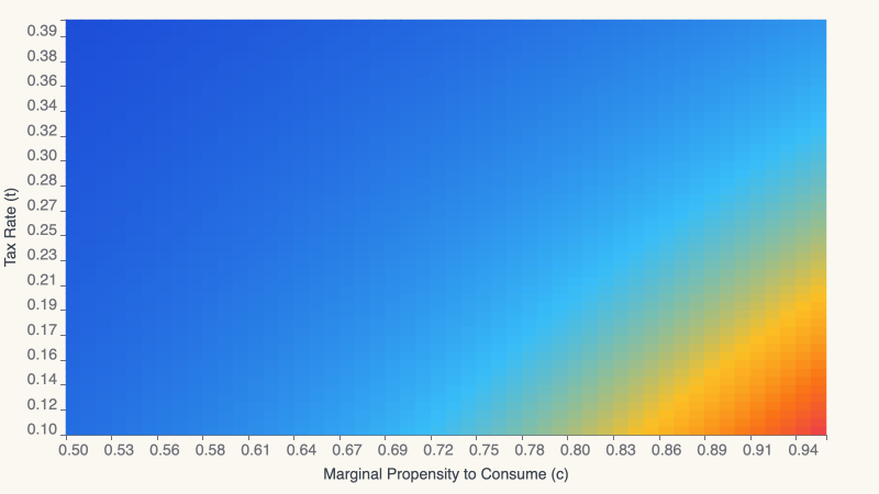
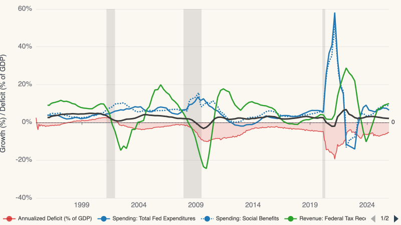
 Government Spending, Debt, and the Fiscal Multiplier
A forensic look at the fiscal gap and shifting debt burdens that decide whether deficits still buy growth.
 Jan 15, 2026
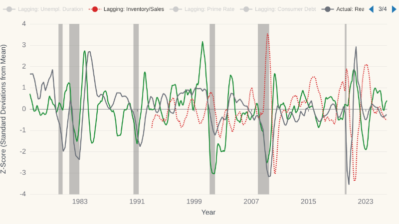
 Indicators for Economic Cycles
A composite macro index highlights the economy’s upward drift, while standardized indicator z-scores reveal where we sit in the cycle.
 Dec 6, 2025
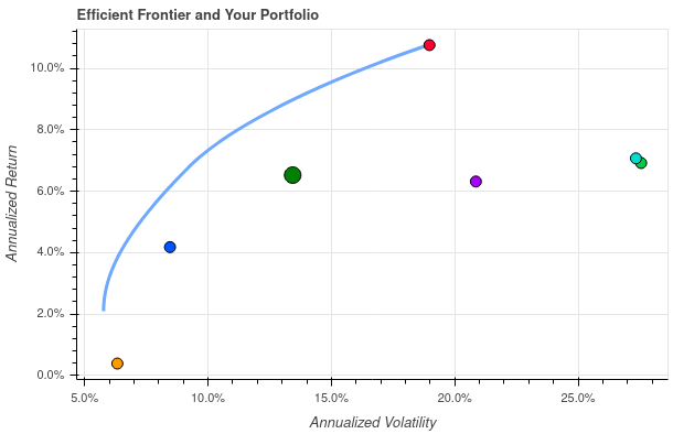
 Asset Allocation: Finding the Sweet Spot Between Risk and Return
Efficient frontiers, tangency portfolios, and Sharpe ratios show why good allocation aims for durable returns with restrained risk rather than heroic forecasts.
 Nov 20, 2025
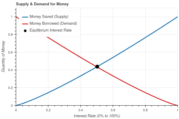
 Interest Rates: The Price of Moving Money Through Time
Interest rates emerge where savers pushing money into the future meet borrowers pulling money into the present, making them the market price of time itself.
 Nov 18, 2025
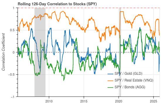
 Contagion and the Illusion of Diversification
A 126-day rolling correlation study of SPY versus GLD, VNQ, and AGG shows how contagion has turned traditional hedges into simple equity beta since 2020.
 Nov 13, 2025
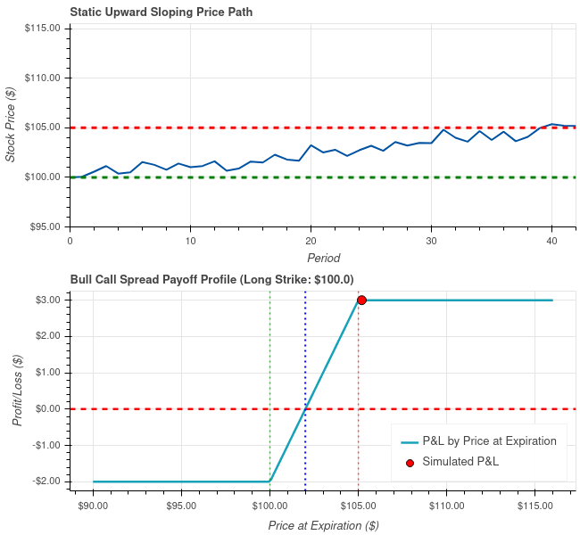
 Bull Call Spreads: Low-Risk Income From Measured Rallies
A long bull call spread defines risk, sets a capped upside, and converts slow stair-step rallies into dependable option income.
 Nov 8, 2025
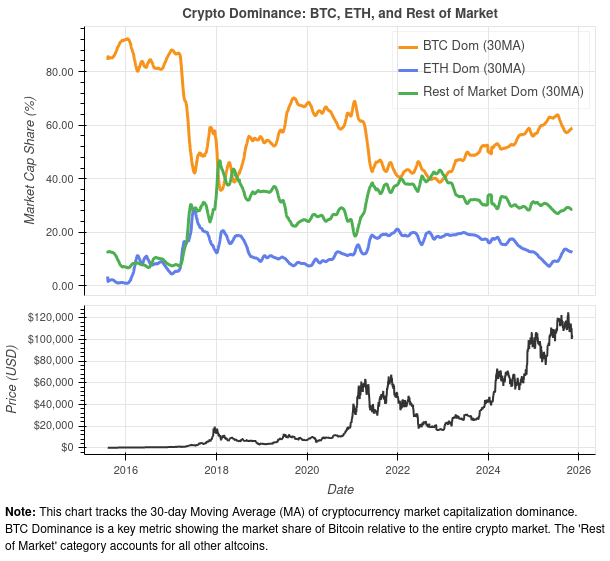
 Crypto Dominance Cycles: Why Bitcoin's Lead Rarely Lasts
Dominance charts show Bitcoin concentrating capital before every major rotation. Today's spike hints that market caps may soon converge again.
 Nov 7, 2025
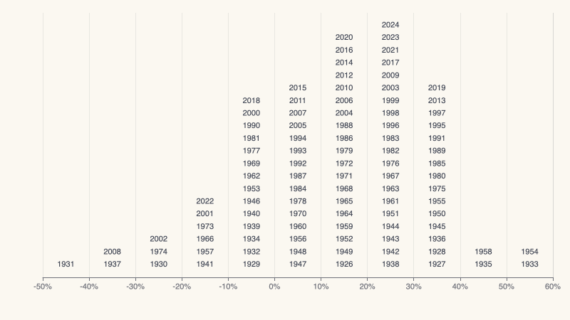
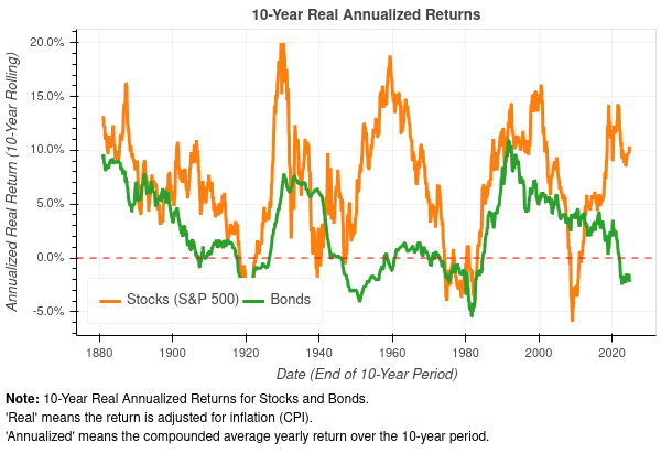
 Investor Reality Check: Inflation, Cycles, and Real Returns
Shiller's century-plus data shows why beating inflation and respecting stock-bond cycles is the only path to lasting wealth.
 Nov 3, 2025
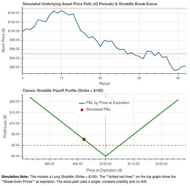
 Volatility Trigger: Riding Big Moves with a Long Straddle
When you expect a surge in volatility but not a specific direction, the long straddle turns price uncertainty into a defined-risk trade.
 Nov 1, 2025
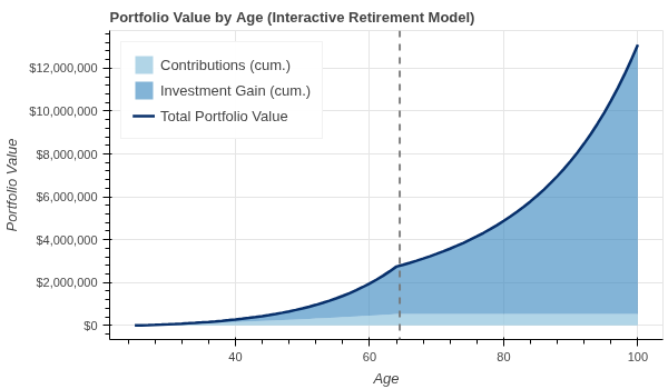
 A Path to Financial Freedom: Compounding and Consistent Investing
Compounding, disciplined dollar-cost averaging, and a freedom calculator transform financial independence from theory into a concrete timeline.
 Oct 31, 2025
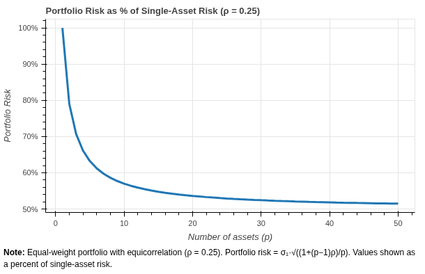
 Why Asset Diversification Works: An Illustration and Simulation
Modern Portfolio Theory, simulation evidence, and decades of market history show how diversification protects compounding and lifts risk-adjusted returns.